
DIGISOFT® Design Tips

In order to set yourself up for success in the POD industry when printing with DIGISOFT®, it’s important to prepare your art files properly to optimize the quality of your final product. Below you will find a few design tips that will help you avoid basic print file mistakes.
You can find our full DIGISOFT® Design Guidelines & Best Practices document here.
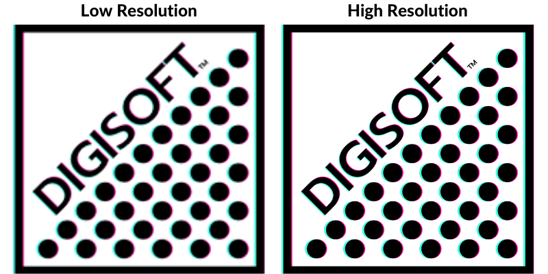
Create art at print size with high resolution
DIGISOFT® is able to capture significantly more detail than its DTG counterpart. Because of this, using a high resolution file will yield pretty incredible results. On the other hand, our high resolution output makes it a little more obvious when you use a lower resolution file. We recommend designing at print size with 300 ppi rather than resizing your images to fit the print dimensions.
Use areas of transparency in your design for a softer handfeel
If you’re looking for a barely-there handfeel on your garments, you can use areas of transparency throughout your design to achieve a more lightweight print. A big block of ink will always feel heavy regardless of the decoration method, but DIGISOFT® allows designs with areas of transparency to blend nicely with the garment, giving a much softer handfeel than other print types on the market.
![]()
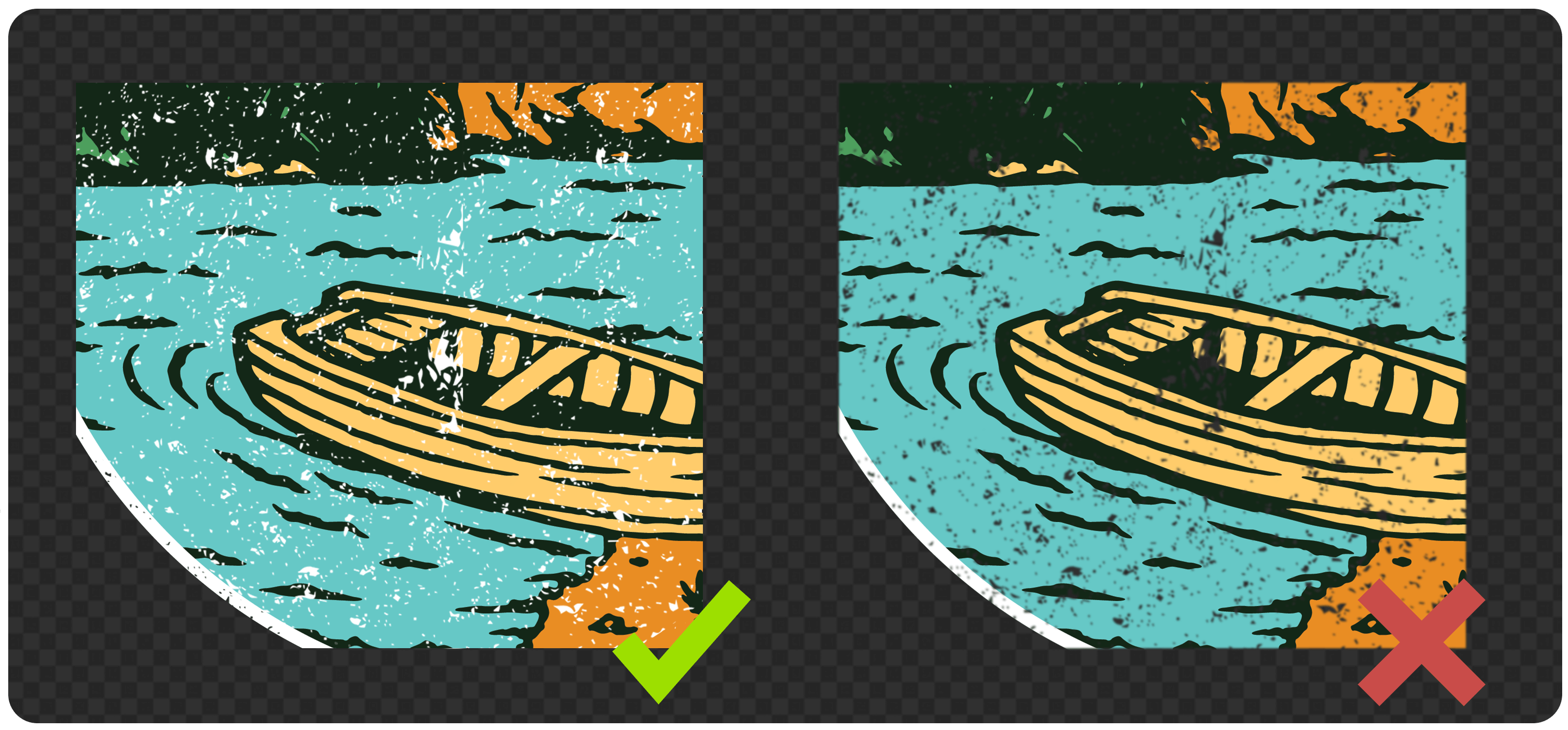
Use 100% opacity in your design elements
In order to ensure the most vibrant print colors, be sure to use 100% opacity in all your design elements. Similar to DTG, DIGISOFT® uses a base layer below pigmented ink to help your print bind to the garment. When there isn’t enough pigmented ink laid on top of that base layer, you may experience muddier print colors. Stick with 100% opacity for full vibrancy.

Avoid transparent gradients – Opt for halftones instead
Just as you want to use 100% opacity in your design elements, you’ll also want to avoid effects like Glow, Smoke, & other types of transparent gradients that rely on reducing the opacity of your pixels. Instead, opt for halftones, which use dots of 100% opacity that reduce in size & density as they move further away from the main design elements. Gradients from one color to another will print beautifully with DIGISOFT®, but avoid gradients that fade from one color to transparency.

Use background color to achieve distressing rather than relying on low opacity pixels
If you want to achieve a distressed look, try adding a white background layer behind your distressed design elements. This will allow you to achieve a “scuffed” appearance without compromising print quality. If you want to use more traditional distressing techniques, try removing semi-transparent pixels afterward for a cleaner result.
Ensure the edges of your design elements are clean & contain no stray pixels
Following the guidelines above will ensure that the edges of your design are clean, but it’s worth mentioning again – anything that is included in your design will be printed with DIGISOFT. That means if you accidentally leave a few stray pixels in your design file, they will print. Similarly, if you resize your file from a smaller size, it may leave semi-transparent pixels around the edge of your design elements. The cleaner the file, the cleaner the print!

A high-quality file will result in a high-quality final product. Taking the time to prepare your files will not only save you time & money in the long run, but it will help you maintain a great reputation for your online store!
Hearing about DIGISOFT® for the first time or want to learn more? Check out our DIGISOFT® FAQ page or printdigisoft.com
Featured Resource