
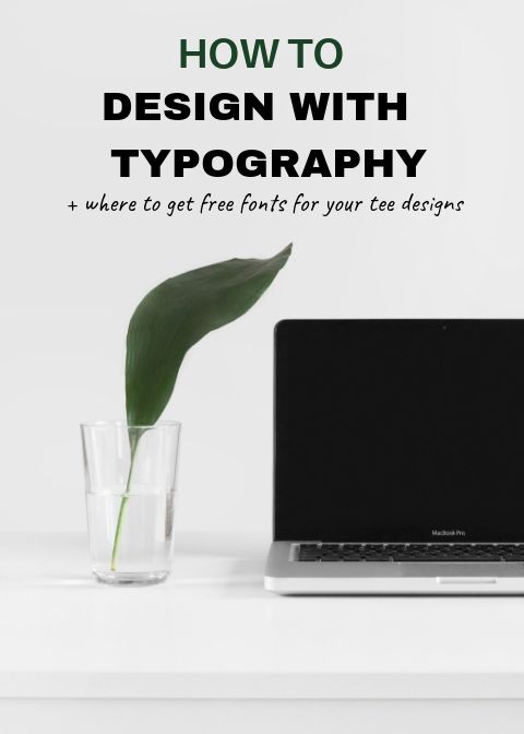
Typography Basics For Print On Demand

Typography is the most important component of graphic design. In this blog post, we’ll cover typography basics that you need to be familiar with before you start your design process.
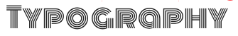
Typography Anatomy
The anatomy is a unique vocabulary that helps to describe certain parts of the individual letters in a specific typeface.
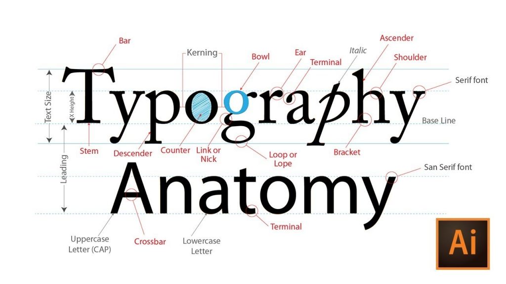
For more detailed information on specific parts, visit A Visual Guide to the Anatomy of Typography. This is a fantastic guide that breaks down typography anatomy in greater detail.
Kerning (Spacing)
Kerning is the process of adjusting the spacing between characters to achieve symmetrical look.
Alignment
Typography offers four alignment options: Left, Center, Right, and Justified. With t-shirts, alignment is used interchangeably. The common alignments that sellers use are center and left.
Center Alignment
Left Alignment

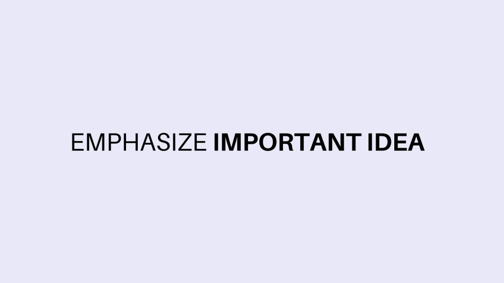
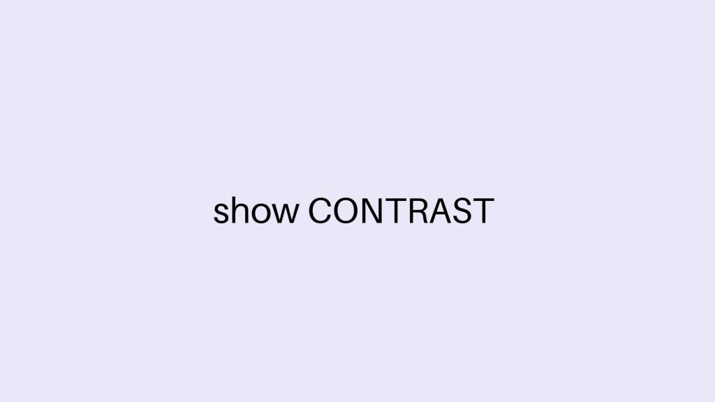
Contrast
There are a few easy ways to make your content stand out. Contrast can be created by scaling, adding weight, using a different form, adjusting the structure, or switching up the colors.
Add Weight
Use Different Form
Adjust Structure
Mix Different Colors
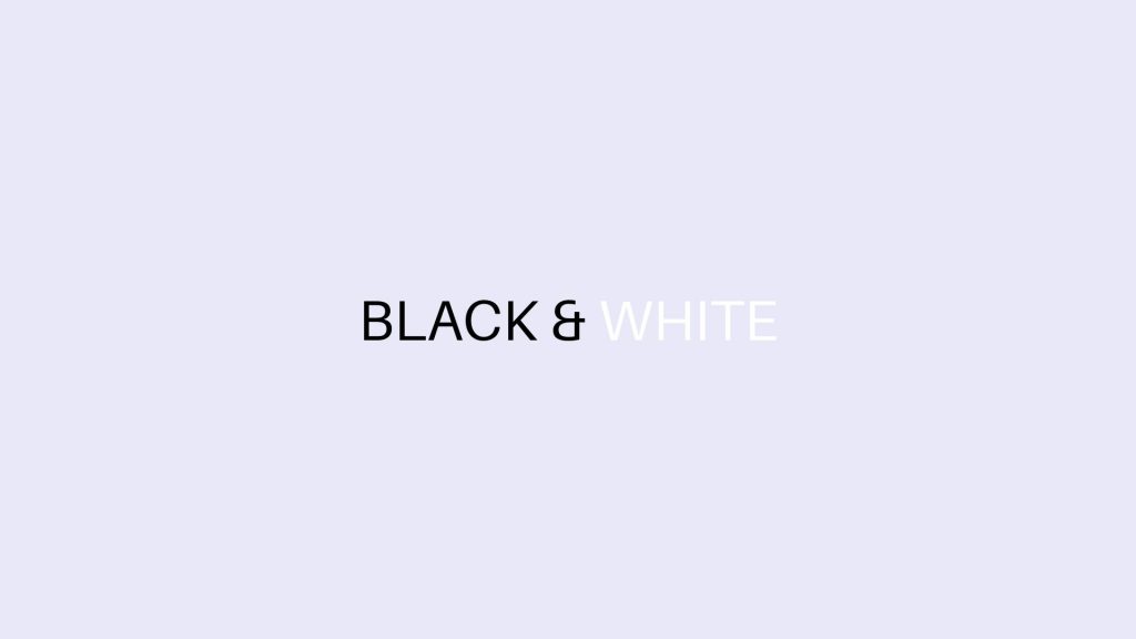
Colors
We have an entire blog post about color psychology. Colors help to draw attention to something important, but too many colors weaken the effectiveness of the use of different colors.
Hierarchy
Hierarchy is used to arrange elements in graphics in a way that it flows well for the viewer’s eyes.
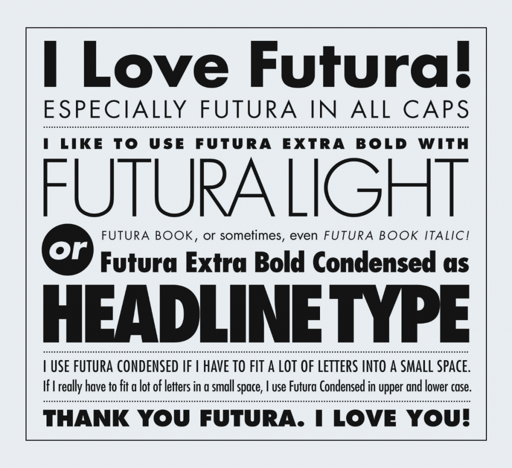
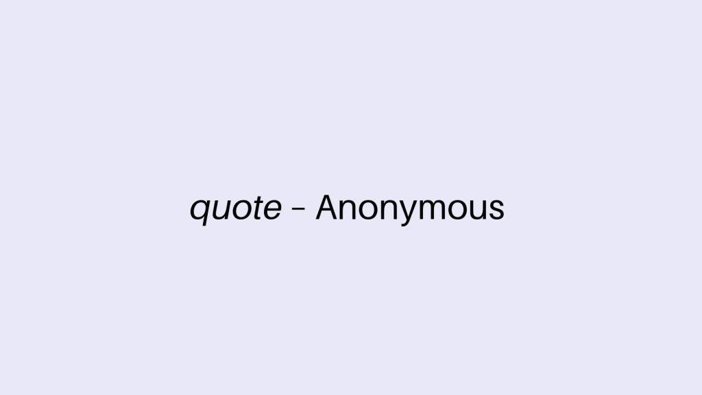
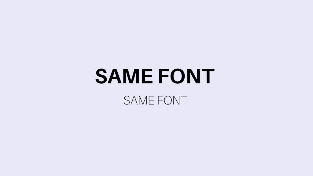
Font Combinations
Not all fonts look good together. The more fonts you use, the busier your artwork becomes. For your font to be readable, you want to limit the number of fonts to two or three. Especially on apparel, it’s important to prioritize readability. Readability attracts customers to purchase.
To pair fonts, there are a few rules to follow:
Same Font: Same family font with different weight
Here, I simply paired together Aileron Regular with Aileron Thin to give the viewer an illusion of clean and non-conflicting typefaces.
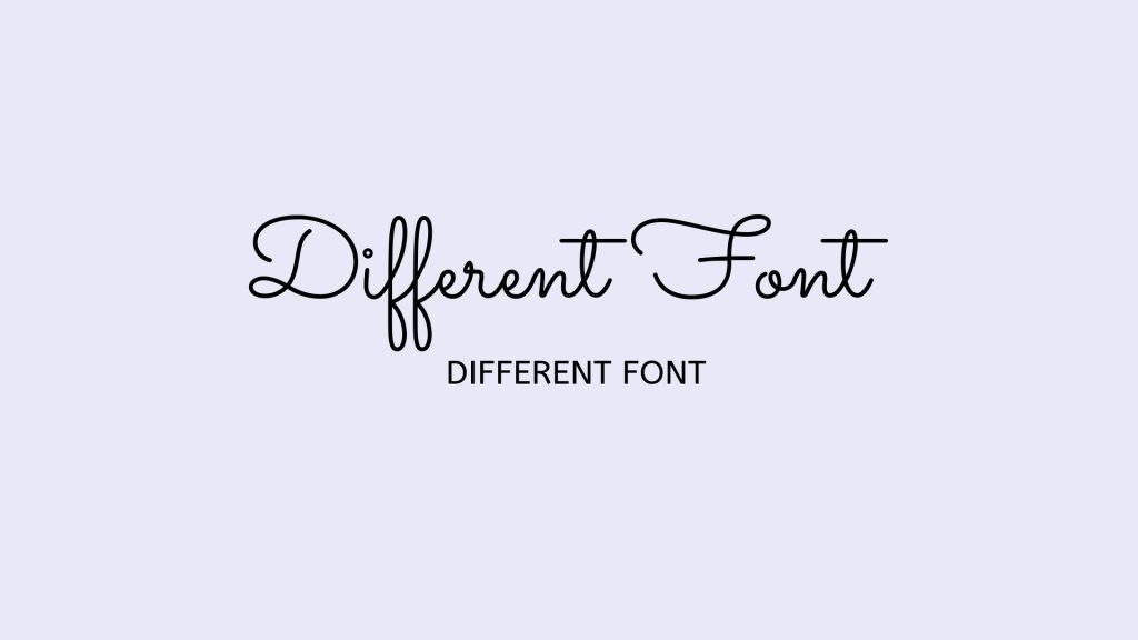
Different Font: Use two entirely different fonts to showcase the contrast
In this particular instance, you want to make sure you don’t use two decorative fonts.
Prioritize Readability
Pretty fonts are fun but that doesn’t mean they are easy to read. Audience that can’t figure out what you are trying to say won’t purchase a product from your store.
Choosing Font For Your Business
Whether you are starting a new business or a brand new collection, it is important to know what vibe your audience should expect from you.
Every font has a unique personality. Choose wisely. You don’t want to give up a wrong vibe.
Example: A seller is selling apparel that supports Military Veterans. That seller might want to consider using more traditional font rather than something playful. In order to be a respected business, your fonts should match the business’s overall objective.
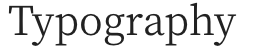
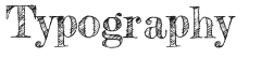
Serif
Font that is considered traditional, classic, or formal. See examples below.
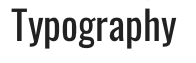
Sans Serif
Fonts that are considered modern, edgy and very readable. See examples below.
![]()
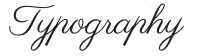
Handwritten
Fonts are considered fancy and up-close personal. See font examples below.
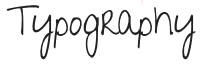
Decorative
Fonts are considered quirky & creative. See examples below.
Where To Find FREE Fonts
1001 Free Fonts
Dafont.com
Urban Fonts
What Format To Install
TTF (True Type Format) – TTFs are more limited because they don’t offer a wider range of characteristics.
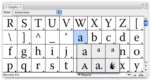
OTF (OpenType Format) – OTF format include special characters (Glyphs).
- Language character sets
- Old-style figures
- True small capitals
- Fractions
- Swashes
- Superiors
- Inferiors
- Titling letters
- Contextual and stylistic alternates
Featured Resource
2 thoughts on “Typography Basics For Print On Demand”